
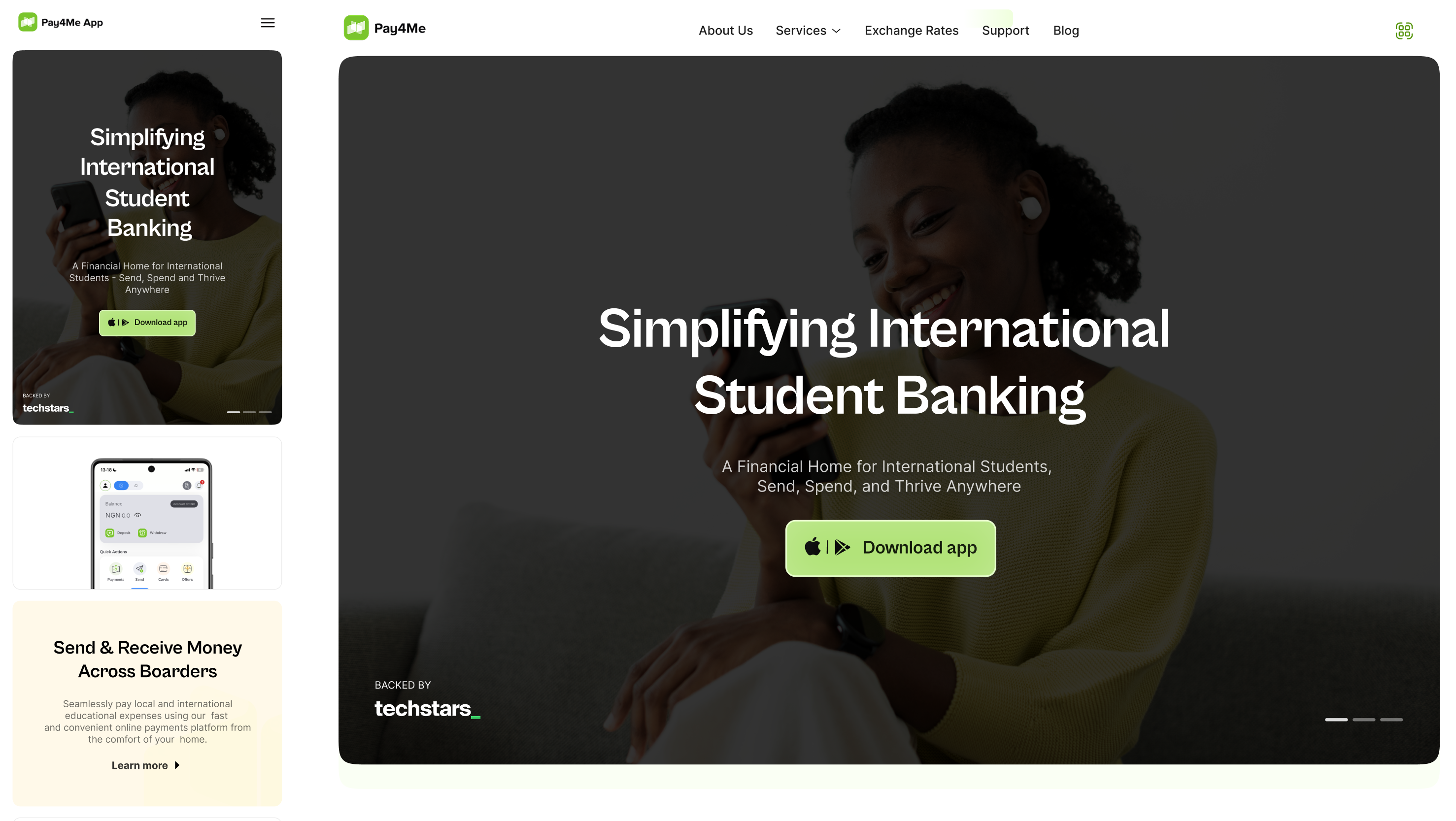
When we partnered with Pay4Me, it wasn’t just about giving the website a facelift, it was about meeting people in moments that really matter. Whether it's paying tuition halfway across the world or sorting out visa fees at the last minute, their users need speed, clarity, and trust. The old site didn’t reflect that urgency or care.
We set out to shift that.
Instead of leading with features, we focused on the feeling of using Pay4Me: peace of mind in stressful times. Every design decision, from content structure to visual hierarchy, was guided by one question: Can someone new understand and trust this within 10 seconds?
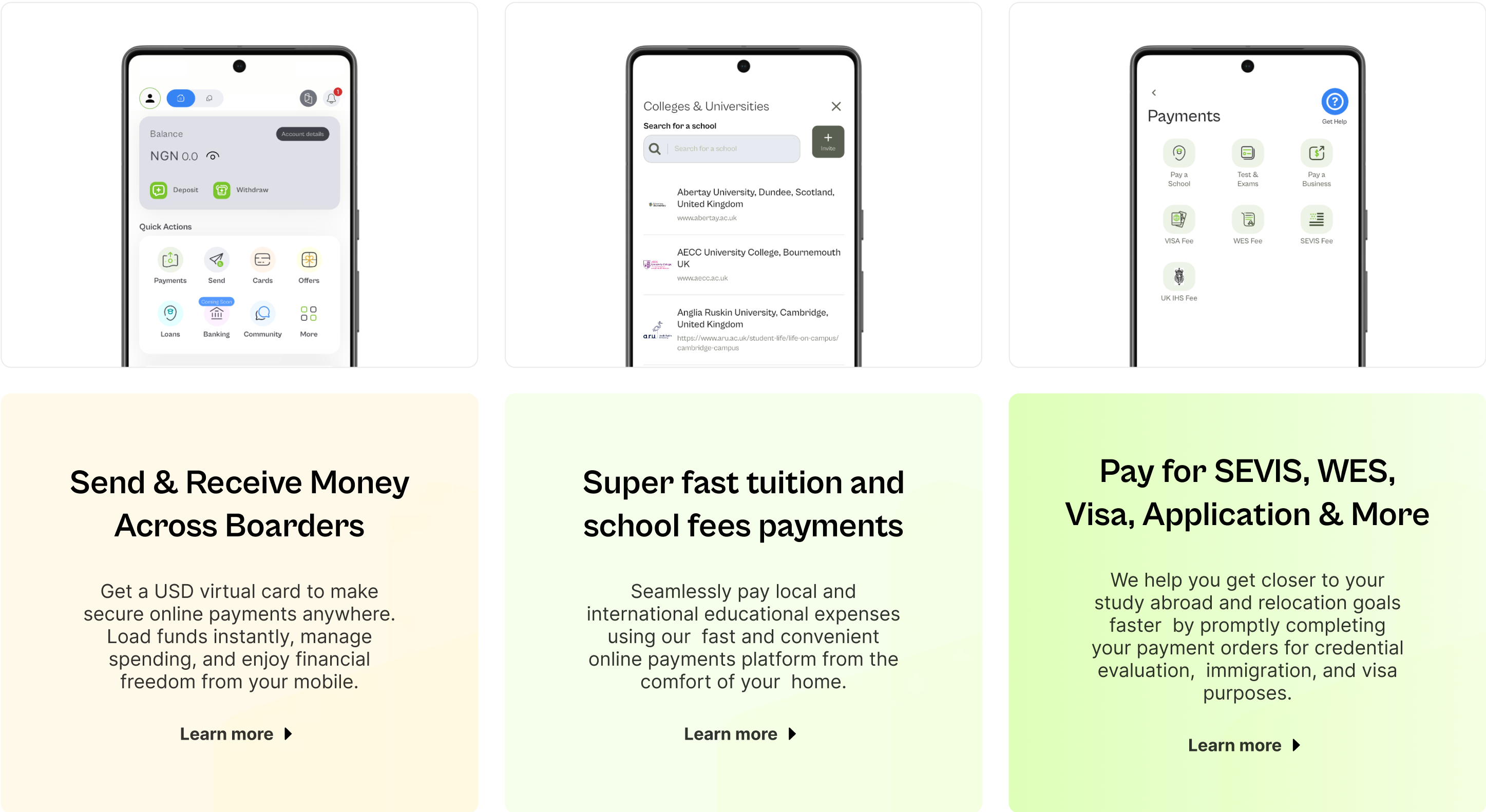
From there, we rebuilt the site to do two things really well:
- Explain the product clearly.
- Inspire confidence, fast.
What changed?
We introduced a cleaner layout, reworked the messaging, and rebuilt the hero section to speak directly to Pay4Me’s core users. Navigation is now effortless, service explanations are crisp, and conversion points are placed with intent—not assumption.
The result?
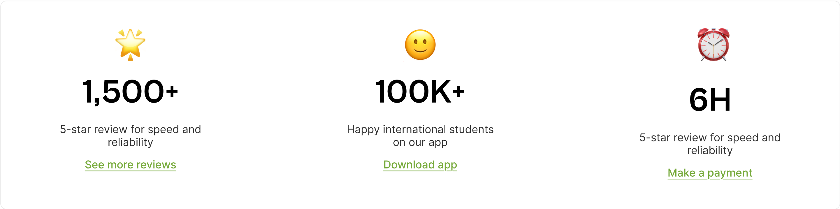
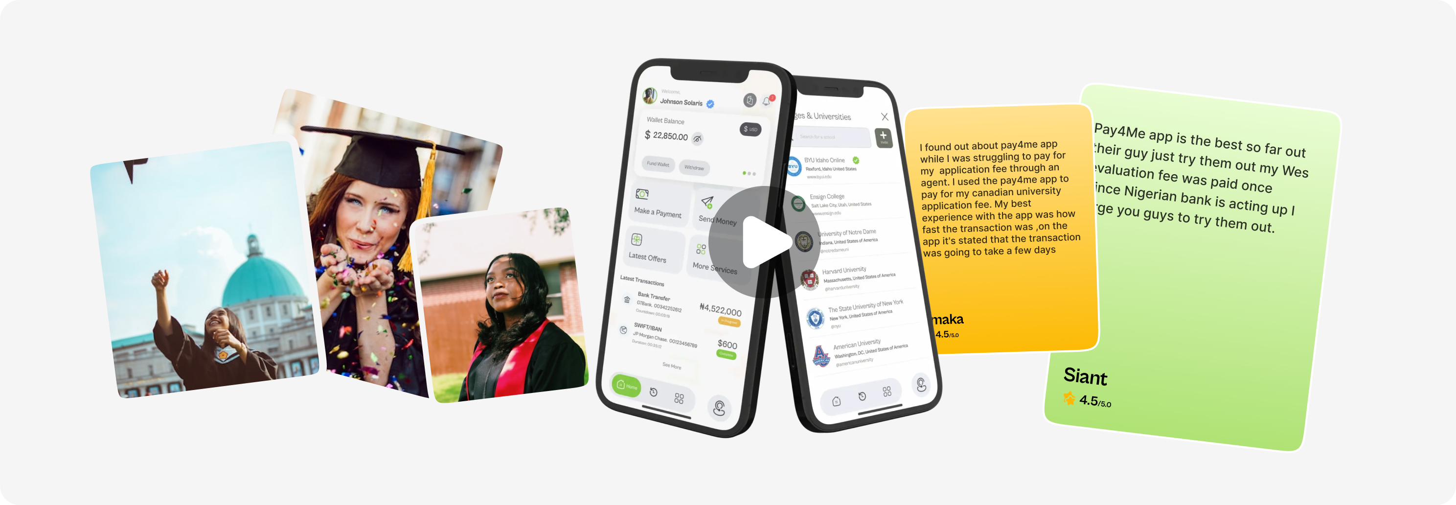
More engagement. More clarity. And more users finding exactly what they need—faster than ever.


